1. What two conventions have I used and why?
-The two conventions that i have used are model/celeb on my magazine cover and direct mode of address.I have used a celebrity on my magazine which is Rita Ora because she is a young successful music artist and the target audience is teenagers because they look up to celebrities.The direct mode of address that i have used is (great new looks for you) this coverline attracts the reader because it is speaking straight to you.
2.What are the effects of my layout,Typography,colour choice and language choice?
-The effects of my layout is that the coverlines on each side of my magazine cover is about the same amount of writing and it is Symetrical. Some of the coverline that I wrote were(you will be glamourable in a flash)this is talking straight to the reader.I have made the title bold so it stands out for customers that look at it from a distance and I have put the title in nice style so it attracts people.
3.What issues of representation have I presented
I have presented Rita Ora as the celebrity on the front cover because teenage girls could look up to her,she is wearing fashionnable clothes so that shows that she could know fashion tips for young girls,also the coverlines that I have written might not be suitable and customers might not like that and put them off of the magazine and they might not buy it.
Monday, 10 March 2014
Wednesday, 12 February 2014
Colour Connotation
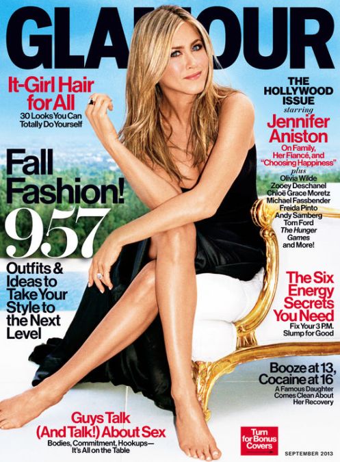 |
| I have chosen this Glamour magazine because it has got a blue background this stimulates that it increases calmness, peace, love, honesty, kindness, truth inner peace, emotional depth and devotion. Also some of the writing is in red and that stimulates that it increases physical energy, vitality, stamina,ground, spontaneity, stabability and passion. |
 |
| I have chosen this health magazine because the background is green and that stimulates that it supports balance, harmony, love , communication, social, nature and acceptance.The title of the magazine is "Natural Health"this is in yellow and it blends in with the other colours such as brown and white. |
 |
| I have chosen this magazine because the celebrity is wearing orange and that stimulates creativity,productivity, pleasure, optimism, enthusiasm and emotional expression.Also the colour orange blends in with the background.Also the blue writing which says hair stimulates that it increases calmness, peace, love, honesty, kindness, truth, inner peace, emotional depth and devotion
GREEN
Really good piece of work with the right amount of detail and analysis. Well Done.
|
Tuesday, 4 February 2014
10 magazine Titles & 10 cover lines
-Highlight.
Show your weakness
-Spotlight.
Shine bright like a diamond
-Star quality.
Show your star quality
-Attract.
Get attractive
-Sparkle.
Sparkle&Shine
-Glorious.
Share your glory
Appeal.
Get appealing
-Flash.
You will be Glamourable in a flash
-Glare.
Look good for next summer
-Time.
Time is money
Tuesday, 28 January 2014
Balance
 |
| This magazine is symetrical because the shape of the writing on the left and on the right is about the same width. The writing is in white so it stands out to the dark red background. Also the colour on both sides are balanced. |
 |
| This magazine is asymmetrical by shape because Oprah's hair is really eye catching because her hair is covering lots of the page so that is the first thing you would look at. Also she is wearing orange and it goes with the title, and the writing is in coloum form. |
 |
This magazine is Asymmetrical because the colour is balanced on the right and on the left because on some parts it is all pink and all black. Also the the headline of this magazine is all blue so it stands out. The position of the celebrity and the writing is very symmetrical because Kim Kardashian has her arms out to the side.The eye direction of Kim Kardashian is looking straight at trying to tell you to read the magazine.The value of this magazine is very positive because it tells you how to look good and how to loose pounds. |
 |
| This magazine is asymmetrical because the colour is balanced very well on each side.the texture balance is very good because the detail in the writing is very easy to read and affective.The shape of the writing is in a coloumn form mostly down the right hand side of the magazine. |
 |
| This magazine is symmetrical, because the colours are all black and white and they blend in with the background. Also Cheryl Cole's eye direction is looking straight at the reader.
AMBER
This is a good start and you have the basics here. However, this does not have a huge amount of detail and you will need to explain your answer more.
|
Sunday, 19 January 2014
Typography
Typography
Serif: (add definition)
Sans
Serif: (add definition)
Find a suitable font for each of the following words from dafont.com
and change the font of the words below. Explain your choice of font for each
word.
Modern
Kids

Sport
Masculine
Feminine

Sophisticated
Bold
History

LIFESTYLE CONVENTIONS
LIFESTYLE
CONVENTIONS
CONVENTION
2
There
is a model or celebrity on the front cover as the main image and he/she is
looking directly at the camera
Why does the magazine use a model or celebrity on
the cover? Why are they looking directly at the camera?
Explain the effect on the target audience.
Magazines use celebrity or a models on to the front
cover to show that it is a good magazine and that they have got a good style in
fashion and how they look. Also around they celebritys, it shows and tells you
ideas about how to get fit and how to get fashionable. Also they person on the
front could be an inspiration to viewers to make them want to look like them
because the person on the magazine is all ways staring at you.

Subscribe to:
Posts (Atom)